Good practical project management solution with severely limited time tracking and scheduling
Verdict: 7.1/10
Wrike is a comprehensive project management and collaboration platform. It offers task management, multiple project views, custom forms, and more. Plus, it offers packages that work for everyone—from solo freelancers to enterprise firms.
That said, it has limited time tracking and scheduling capabilities—which is what I was most curious about. I focused primarily on these features for this review, and I believe these limitations make Wrike unsuitable for those looking for an all-in-one work management solution.
Further, Wrike’s storage limits make me question whether it’s good for industries that work with and store large files—for instance, construction CAD drawings, healthcare imaging files, or advertising videos.
Key Features:
- Time tracking. Let employees log time spent on each task and track timesheets from your homepage.
- Work schedules. Track overtime, paid time off (PTO), extra days, and more for everyone by tagging them in the team calendar.
- Task management. Create and assign tasks, set due dates, and track task status, impacts, and budgets.
- Project views. See all project tasks in your preferred view—list, table, calendar, Gantt chart, or Kanban board.
- Workflows and automation. Set up custom workflows and automate repetitive tasks.
- Integrations. Sync your Wrike account with third-party tools like Salesforce, Tableau, Google Drive, and Zoom.
Pros
- Web, desktop, and mobile apps
- Impressive range of third-party integrations
- Multiple task and project views
- Free plan
Cons
- Limited time tracking and scheduling tools
- Storage limits across all plans
- Glitchy interface and slow desktop app
- Plans sold only in groups of 5, 10, or 25 users
Wrike Pricing
Wrike offers 5 pricing plans, billed annually:
| Plan | Pricing | Seats | Features |
|---|---|---|---|
| Free | $0/user/mo | Unlimited users | Team-wide work week Task management (200 active tasks and subtasks) limit Board, table, and kanban views Email integrations and notifications 2GB storage limit Enterprise-grade security |
| Team | $10/user/mo | 2-15 users | Team-wide work week plus personal schedule tracking Unlimited tasks and subtasks Board, table, kanban, calendar, Gantt views, and dashboard 50 automations/seat Request forms 2GB storage limit Enterprise-grade security |
| Business | $24.80/user/mo | 5-200 users | Everything in Team, plus: Time tracking Team-wide work week plus personal schedule tracking Project portfolio management All boards and real-time report builder 200 automations/seat Dynamic request forms and proofing 5GB storage limit |
| Enterprise | Custom pricing | 5+ users | Everything in Business, plus: 1000 automations/seat Tableau integration Advanced business intelligence API 10GB storage limit Advanced security (single sign-on, 2FA, and more) |
| Pinnacle | Custom pricing | 5+ users | Everything in Enterprise, plus: 1500 automations/seat Advanced resource and capacity planning Advanced analytics and data visualizations 15GB storage limit Locked spaces |
At first glance, Wrike’s pricing solution seemed straightforward, like that of its competitor, Monday.com. But the deeper I dug, the more confusing it became.
First, I was disappointed to see the 2 features I was most interested in—time tracking and scheduling—weren’t available on all plans. Time tracking is available only on the Business plan and higher. With scheduling, you can set a fixed work week for your team on all plans, but employees can track their PTO and vacation days only on higher plans.
Additionally, Wrike gives the illusion that it’s simply priced per user. It doesn’t transparently say that you can purchase seats only in groups. You must pay in groups of 5 for up to 30 users, groups of 10 for between 30 and 100 users, and groups of 25 for more than 100 users. Only need 11 users? You must buy 15 seats.
Furthermore, you can buy the Business plan directly from the platform for only up to 15 users. Larger groups must contact Wrike for a custom quote. I think this adds unnecessary complexity to companies trying to scale quickly.
Also, I had to learn about this through the FAQs at the bottom of the pricing page. I didn’t appreciate being misled into believing I could opt for 5-200 users on the business plan at $24.80/user/month.
Finally, Wrike’s plans are pretty costly for what the platform offers. Here are the prices for the lowest-cost plans for some of the leading competitors in the space.
| Team size | Wrike (Business) | Asana (Advanced) | Monday.com (Pro) | Connecteam (Basic) |
|---|---|---|---|---|
| View pricing | View pricing | View pricing | View pricing | |
| 10 users | $248/mo | $249.90/mo | $190/mo | Free for life—all features and dashboards |
| 20 users | $496/mo | $498/mo | $380/mo | $29/mo |
| 30 users | $744/mo | $747/mo | $570/mo | $29/mo |
| 50 users | $1240/mo | $1245/mo | Contact vendor for pricing | $39/mo |
| Read our full Asana review | Read our full Monday review |
Wrike’s plans have some positives. The platform gives you 20 collaborator invites or 15% of your total user count (whichever is greater) as part of your subscription. You can use these to add external stakeholders or clients with limited access.
I also appreciate that in addition to its free plan, Wrike offers a 14-day free trial.
Verdict: 5/10
Wrike Usability and Interface
Signing up for Wrike was straightforward and similar to the Asana sign-up process. I signed up using my email ID, verified my account, and was instantly able to create a project, add tasks, select my preferred views, and add team members.
Once I got to my web homepage, I was impressed by its simplicity. The interface was clean and user-friendly. It wasn’t clunky and crowded with features like I’ve seen in apps like ClickUp, but it wasn’t customizable like Asana’s. I liked the navy blue and white color scheme. Key features like the projects, inbox (notifications), task dashboard, and search bar are neatly laid out in the left sidebar.
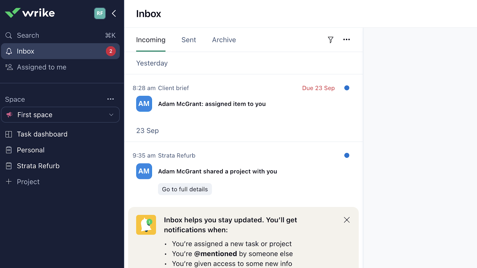
Individual features were intuitive and easy to navigate. A big concern for me, however, was that when I left my browser idle and returned, my page kept loading no matter how many times I refreshed it. I had to quit the browser and start again. At first, I thought this was a browser issue, but then I also noticed slow loading times in the desktop app.
Finally, while I was initially happy to see “Accessibility” in settings, the only option was to match Wrike’s scroll setting to the default setting. I didn’t see any support for those with visual, motor, or other impairments.
Verdict: 6/10
Mobile app
Wrike’s desktop app and web-based portal are identical in look, feel, and usability. But the mobile app is different.
The Wrike iOS app interface was clean. The bottom bar lists features including the inbox, search bar, workspaces, form requests, and settings. Finding my projects took me some time, though. This was listed within the “Spaces” (workspaces) feature. Further, I also had to scroll down within projects to see the tasks, which were called “Sub-items.” Overall, finding features in the mobile app wasn’t as intuitive as this was in the desktop or web apps.
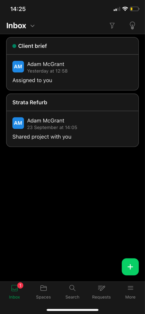
Here’s how Wrike’s mobile app compares to its web and desktop apps.
| Menu Item | Admin | Employee | ||||
| Web portal | Desktop app | Mobile app | Web portal | Desktop app | Mobile app | |
| Core features | ||||||
| Inbox | ✅ | ✅ | ✅ | ✅ | ✅ | ✅ |
| Projects | ✅ | ✅ | ✅ | ✅ | ✅ | ✅ |
| List view | ❌ | ❌ | ✅ | ❌ | ❌ | ✅ |
| Table view | ✅ | ✅ | ✅ | ✅ | ✅ | ✅ |
| Kanban board view | ✅ | ✅ | ✅ | ✅ | ✅ | ✅ |
| Calendar view | ✅ | ✅ | ✅ | ✅ | ✅ | ✅ |
| Gantt view | ✅ | ✅ | ✅ | ✅ | ✅ | ✅ |
| Workflows | ✅ | ✅ | ❌ | ✅ | ✅ | ❌ |
| Request forms | ✅ | ✅ | ✅ | ✅ | ✅ | ✅ |
| Time tracking | ✅ | ✅ | ✅ | ✅ | ✅ | ✅ |
| Work schedules | ✅ | ✅ | ❌ | ✅ | ✅ | ❌ |
| Analysis features | ||||||
| Task dashboard | ✅ | ✅ | ❌ | ✅ | ✅ | ❌ |
| Reporting | ✅ | ✅ | ❌ | ✅ | ✅ | ❌ |
| Management features | ||||||
| Search | ✅ | ✅ | ✅ | ✅ | ✅ | ✅ |
| Profile settings | ✅ | ✅ | ❌ | ✅ | ✅ | ❌ |
| Admin console | ✅ | ✅ | ❌ | ❌ | ❌ | ❌ |
| Manage plan | ✅ | ✅ | ❌ | ❌ | ❌ | ❌ |
Wrike’s mobile app, while user-friendly, isn’t as full-featured as I would’ve liked. Additionally, I was confused about why the list view was available on mobile but not the web app. While I understand that mobile apps are optimized for smartphones, I’d like more consistency across devices.
Verdict: 6/10
Wrike Core Functionalities
Time tracking
Wrike claims to be among the best time tracking software but offers time tracking only on the Business and higher plans.
Users can click on start, pause, and stop tracking time within each individual task—or add hours manually. On one hand, this helps them allocate how much time they spend on each task. But I worry it’s not a user-friendly process for multitasking employees.
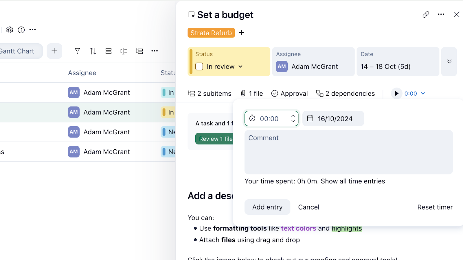
Once employees have tracked their time, you can view, edit, and approve individual timesheets from the right sidebar in your Wrike web app. Overall, Wrike’s time tracking feature is pretty basic. It doesn’t offer advanced functionalities like GPS tracking, geofencing, and other tools seen in apps like Deputy.
It also can’t differentiate overtime hours from regular hours for easy and accurate overtime calculations.
Verdict: 6/10
Scheduling
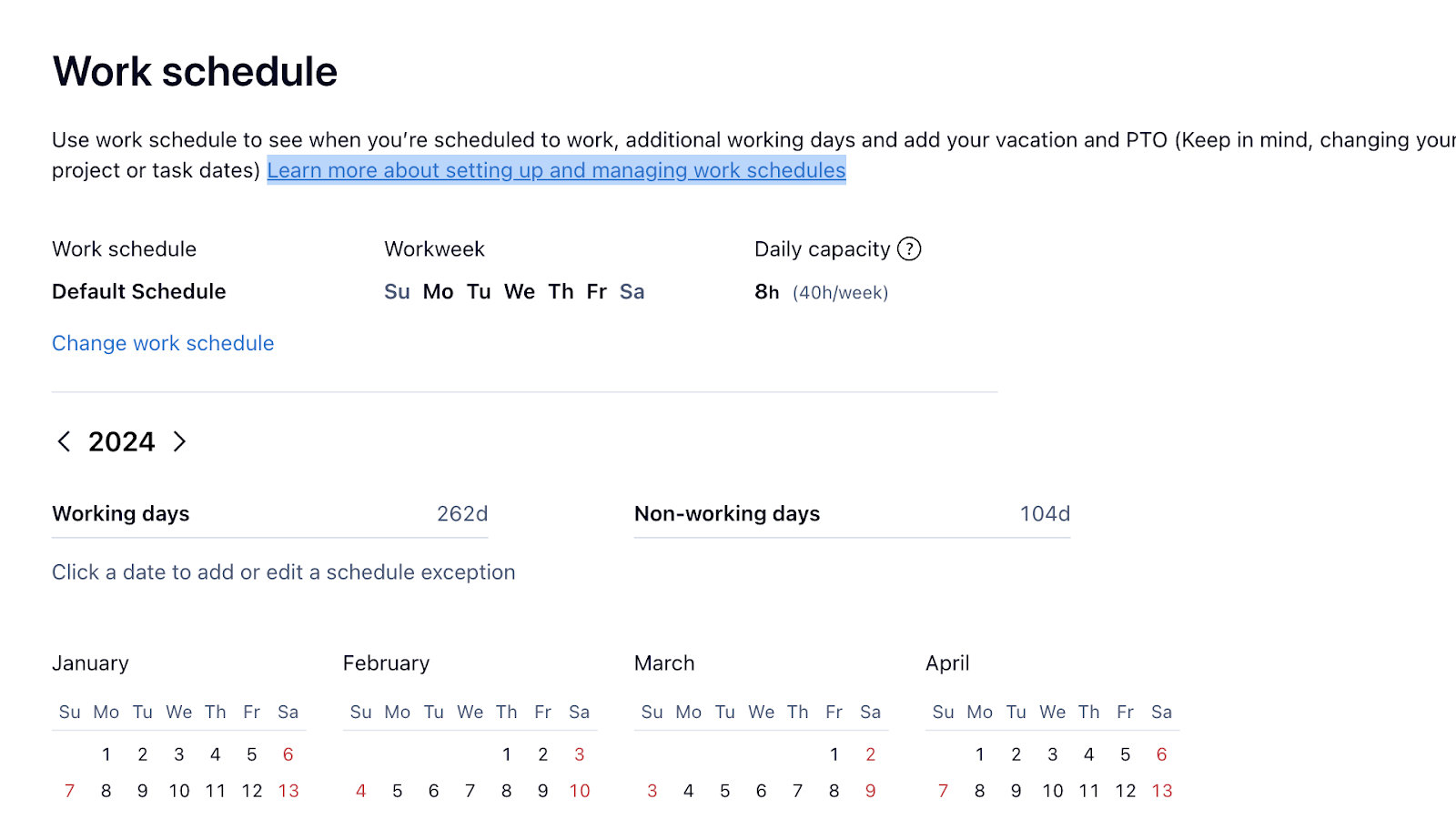
Wrike also offers work scheduling, though it mostly relates to tracking employees’ work week and days off. While it isn’t front and center on the app, you can find this hidden tool in your profile settings.
I thought this feature was very limited—especially for the Free and Team plans. You can mark which days are working days versus non-working days for each team member. You can also assign working capacities—for instance, 8 hours per day—to provide clarity on expected working hours. On the Business plan and higher, you can create custom schedules for each user, which are basically working days and daily capacities.
Unfortunately, despite having some good functionality, you can’t actually create shift schedules on Wrike for each individual like you can with Jobber.
Employees can also use this tool to mark certain days of their calendar as extra work days, PTO, overtime days, and more, and admins can track these, making it easier to plan schedules, assign tasks, and stay compliant with local labor laws. One thing I found cool was that when an employee marks a day off, you can’t assign them tasks due for that day.
What I didn’t like? There’s no formal leave requesting or overtime approvals system on Wrike, so it feels like managers don’t have much control over which days employees put as vacation, overtime, etc. The only way to do this is by using the forms feature to create separate forms for each of these requests—a manual and time-consuming process.
Verdict: 6.5/10
Request forms
I really liked Wrike’s form feature. It lets you create custom forms from scratch for basically anything from a client brief questionnaire to employee vacation requests.
You simply create a new form, name it, add a description, and start adding questions. Wrike supports multiple question types, such as single-line text, multiple-choice, and open text.
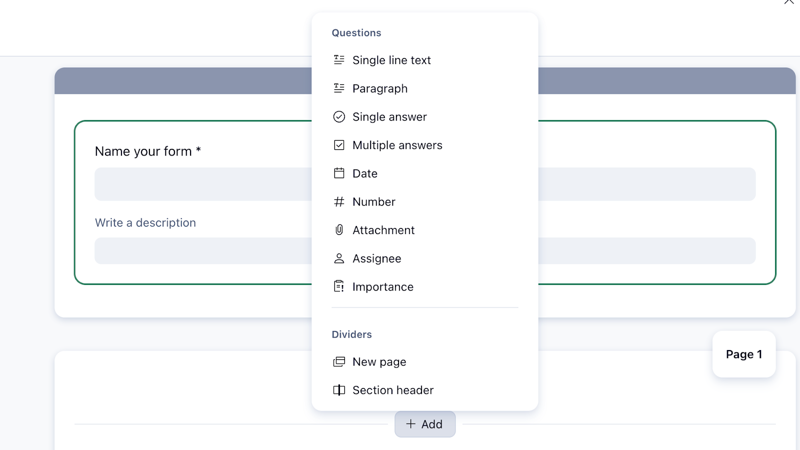
You can then assign it to the relevant team member and project or create a public link for external sharing, which I found very useful. I also liked that Wrike offers a few templates—such as this vacation approval tracker that lets you organize, approve, and deny requests from the app. Helpfully, you’re notified when requests come through.
I’d like to see more ready form templates that most businesses could use, though.
Verdict: 9/10
Projects, tasks, and spaces
Project management is Wrike’s primary feature, so I had to test it. You can create projects with 1 click using the “+ Project” sign from the left sidebar. Each project has its own tasks, deadlines, files, team members, and more.
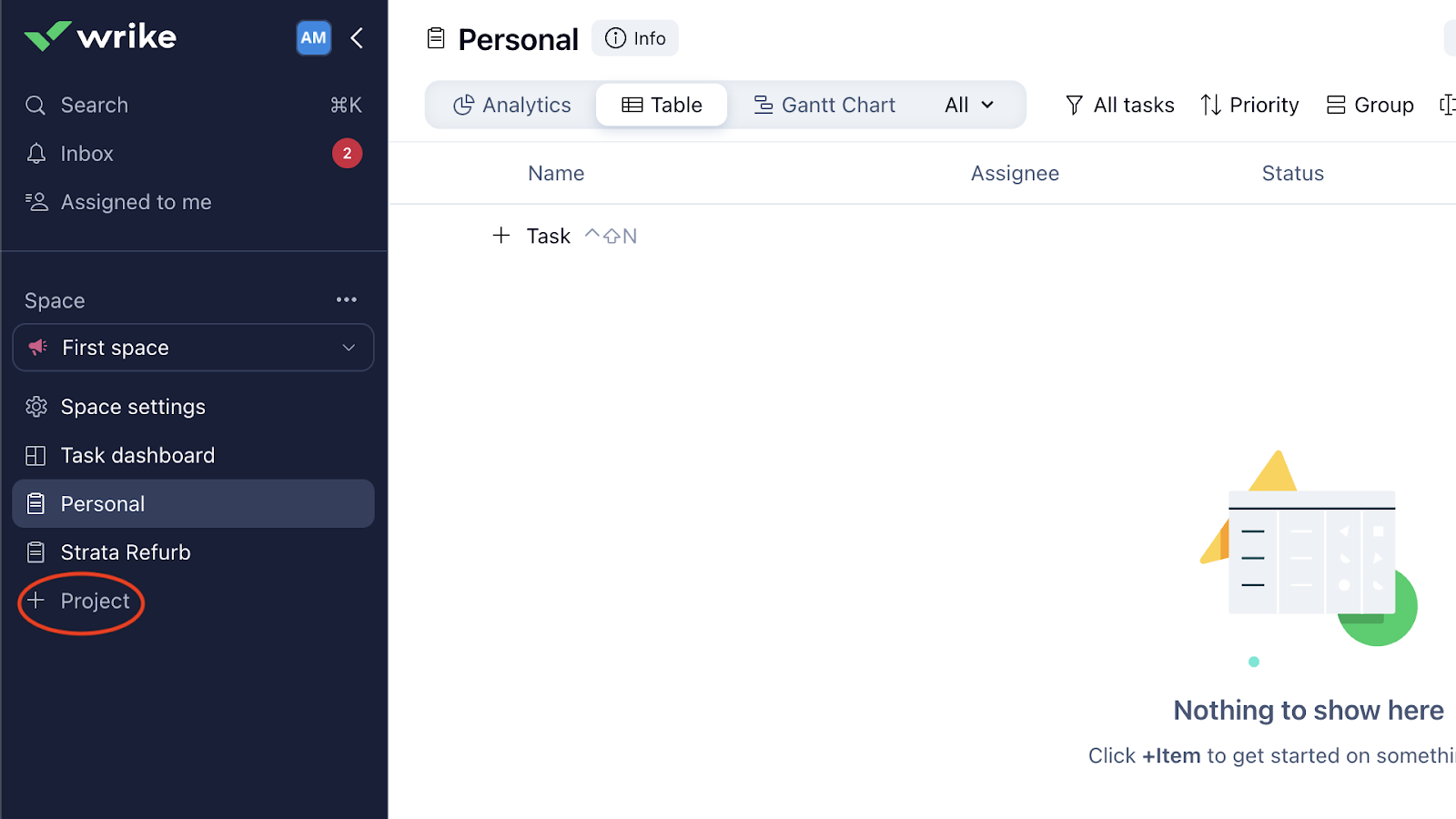
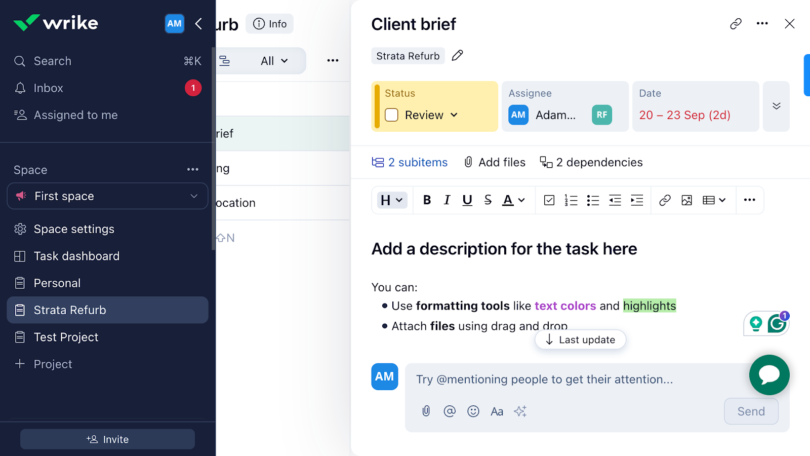
Each project has a dashboard you can view and edit as a board, table, calendar, or Gantt chart. You can create and add tasks and subtasks, assign them to team members, add statuses, attachments, budget, dependencies, and more.
I also like that you can add comments, format them in different styles and colors, and add @ mentions within tasks to notify relevant team members and organize task-related communications.
Wrike’s help center says you can mark entire projects or individual tasks as billable or non-billable. Disappointingly, this is available only on the Enterprise and Pinnacle plans. I couldn’t test it—and wasn’t happy to see such a critical feature missing from the other plans.
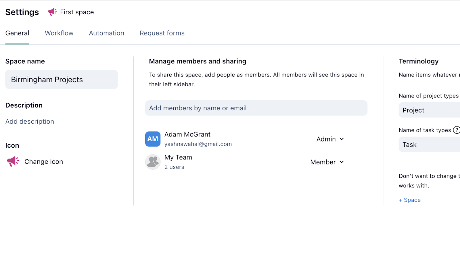
Wrike lets you organize projects into workspaces called “Spaces.” You can have a space for a specific location, team, or department with all the projects within that group. I like that you can customize folders and workflows for different spaces.
The coolest part? Within a space, you can customize how you label projects and tasks. For example, they can be “clients” and “deliverables.” I haven’t seen this option in other project management apps.
Verdict: 10/10
Workflows and automation
I was excited to see Wrike’s workflows and automation features. While the automation tool was impressive, I was disappointed at the workflows’ customizability.
Wrike lets you edit and customize workflow stages using a ready set of statuses only. These include “New,” “Planned,” “In Progress,” and a few more. You can’t create your own.
Automations were better. You can choose from various ready and recommended workflows for different categories, such as reminders and @ mentions, due dates, and workload. You can trigger actions like re-assigning tasks, updating task statuses, sending messages, or creating dependencies when specific conditions are met.
I also appreciated that I could create my own custom rules. I set a rule that employees would receive a message of appreciation if their project was completed before a scheduled deadline.
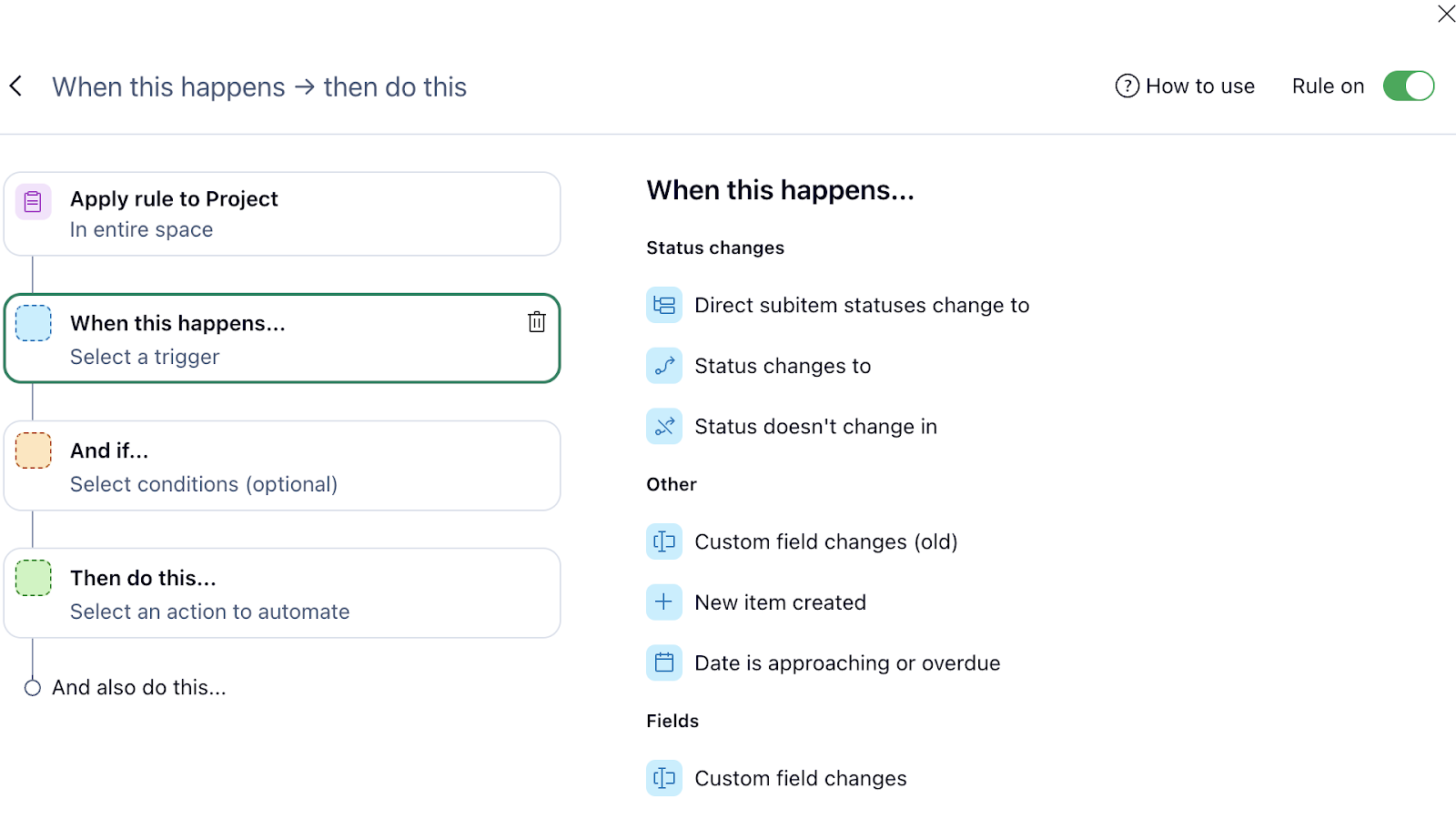
Wrike’s automations give you a decent amount of triggers and tasks to create your own custom rules.
That said, I would’ve liked to see more customization options—like there are in ClickUp and Airtable. For example, I couldn’t create a complex trigger that delays task B’s due date if task A gets delayed.
Verdict: 8/10
Integrations
Wrike has some impressive third-party integrations. For instance, it integrates with Google Drive for document management, Salesforce for customer relationship management, and Slack for internal comms.
Disappointingly, there are no direct payroll integrations, but it has an API portal for custom integrations.
Also, users wanting the full range of work management solutions—including advanced time tracking and internal communications—must subscribe to these platforms separately to integrate them with Wrike. Costs can add up quickly.
Verdict: 8/10
Wrike Security Features
Wrike has great security features. Here’s a summary:
- End-to-end data encryption secures all data in transit—so information shared between users and servers is protected.
- Two-factor authentication (2FA) adds an extra layer of security by requiring an extra verification step in addition to passwords.
- Single sign-on (SSO) simplifies secure user access and management.
- Access controls and permissions ensure only authorized users can view or edit certain information.
- Audit logs enable administrators to monitor activity histories, track changes, and detect suspicious behavior.
- Wrike complies with various industry standards such as GDPR (General Data Protection Regulation), CCPA (California Consumer Privacy Act), and HIPAA (Health Insurance Portability and Accountability Act).
My main complaint? You can access certain core security features—such as SSO or 2FA—only on Enterprise and Pinnacle plans.
Verdict: 8/10
Wrike Reporting & Analytics
Wrike features an entirely customizable Dashboard that starts as a blank canvas. You can click on “+ Widget” to add the metrics, charts, and graphs you’re interested in seeing on your personal dashboard.
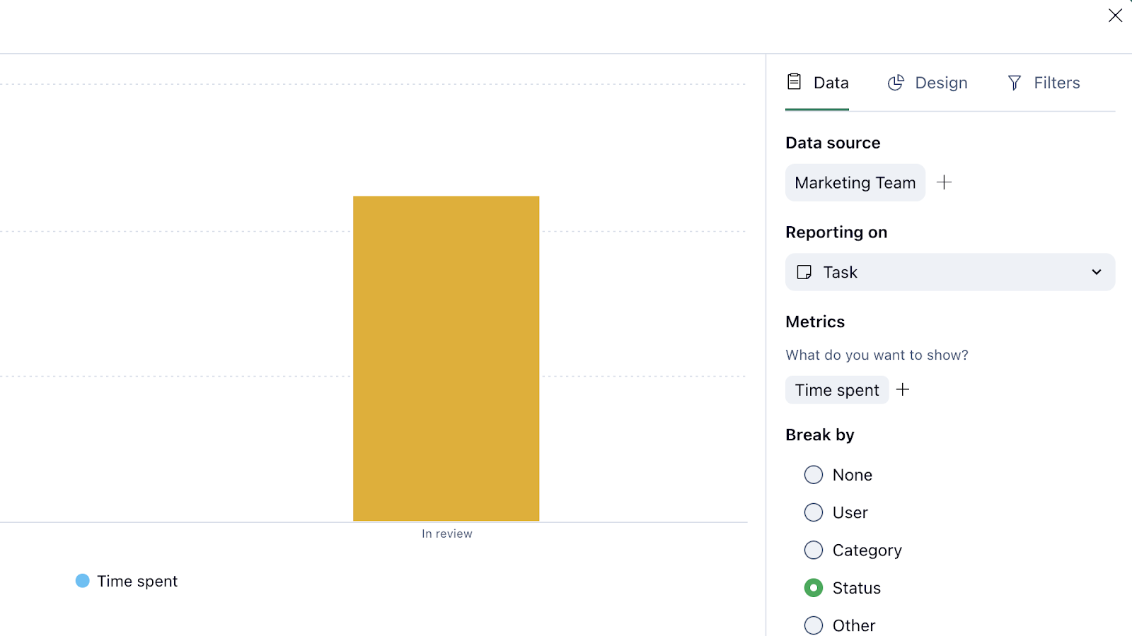
I appreciate the range of ready templates you can add to your dashboard—and that Wrike lets you create custom widgets with the parameters and chart types you want. I was also pleased I could add “time spent,” “capacity,” and “available hours” as metrics for specific tasks, projects, or team members. I only wish I could also see associated labor costs.
I couldn’t find a way to export my dashboard to Excel, CSV, or PDF—despite the website’s claim that this was possible. It may be available only on higher plans. Additionally, I would’ve liked to see the dashboard feature on the mobile app.
Verdict: 7.5/10
Wrike Customer Support
Wrike has one of the most comprehensive help centers I’ve seen. It offers:
- Interactive training and video tutorials.
- A knowledge base with guides about making the most of the platform.
- Troubleshooting FAQs.
- Release notes with details about the latest product changes.
- Live monthly webinars.
- A community forum to post questions, feedback, suggestions, and more.
You can also complete and submit a request form through the help center. I did this, but it took over 3 days to hear back. Compare this with Slack, whose support team replied to my question in less than 10 minutes.
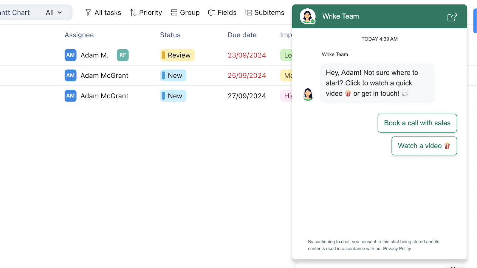
There’s also no real-time phone or chat support. Although my homepage interface had a chat icon, it enabled me to watch a video or book a call with sales only—I couldn’t chat with a support agent.
Verdict: 7/10
What are Wrike Review Ratings from Review Sites?
(As of October 2024)
Capterra: 4.3/5
G2: 4.2/5
Software Advice: 4.3/5
TrustRadius: 8.3/10
GetApp: 4.3/5
Google Play Store: 4.2/5
Apple App Store: 4.6/5
Wrike App Review
Wrike is a great project management and collaboration solution with a remarkable project and task management tool, customizable dashboards, and handy request forms.
But as a time-tracking and scheduling solution, it’s pretty limited. The pricing plans were also confusing and—in some cases—misleading.
Further, I experienced problems with Wrike’s usability and felt there was room for improvement in its automation features and customer support.
Connecteam: The Better Wrike Alternative
Here’s why Connecteam is the best Wrike alternative.
Time tracking
Connecteam provides a full-featured time clock app. Employees can clock in and out with a single click from any device, or you can set up a shared kiosk for centralized time tracking. Additional tools like GPS tracking, geofencing, and time off and overtime management give you complete visibility into how and where workers spend their scheduled hours.
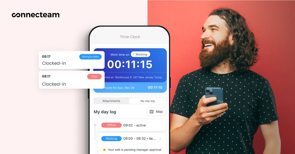
You can view digital timesheets easily from your admin dashboard and sync them with popular payroll partners for easy payroll processing.
Automated shift scheduling
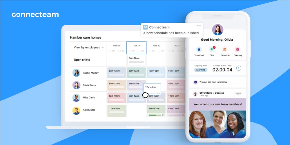
Connecteam also offers job scheduling tools. You can create shifts from scratch using easy drag-and-drop tools, copy previous schedules, or use Connecteam’s cool auto-scheduler, which assigns shifts based on employees’ preferences, locations, availability, and more with 1 click.
Task management with integrated real-time messaging
I think Connecteam has excellent project management features. Employee task tracking makes it easy to create and assign tasks and subtasks (including recurring tasks). You can add due dates, notes, files, images, to-do lists, and more.
Your admin dashboard lets you track task progress in real time, send completion reminders, and filter tasks by the due date or priority.
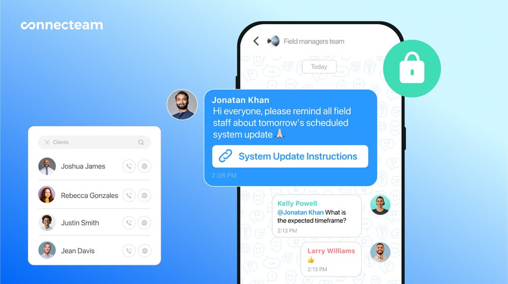
And the online team chat integrates with the task tool. While Wrike lets you add comments and @ mentions, Connecteam lets team members have real-time conversations in a chat-like interface within each task.
Custom forms, digital checklists, and more at affordable prices
The digital forms and checklists tool is even better than Wrike’s “Request forms” feature. You can create custom forms from scratch or use pre-made templates. There’s even a checklist format, which Wrike doesn’t have.
And you can have employees complete forms as part of their tasks.
Plus, Connecteam has various other features, and prices start at just $29/month for up to 30 users.
Get started with Connecteam for free today!
FAQs
Wrike offers a free 14-day trial. It also has a free plan with limited features.
Wrike offers a Business Associate Agreement (BAA) that adheres to HIPAA security standards. This is available upon request.
